Client:
- Gertrude Hawk Chocolates
Project:
- Interactive Website and Rebranding
Solutions:
Industries:
Headquarters:
- Dunmore, PA
Interactive
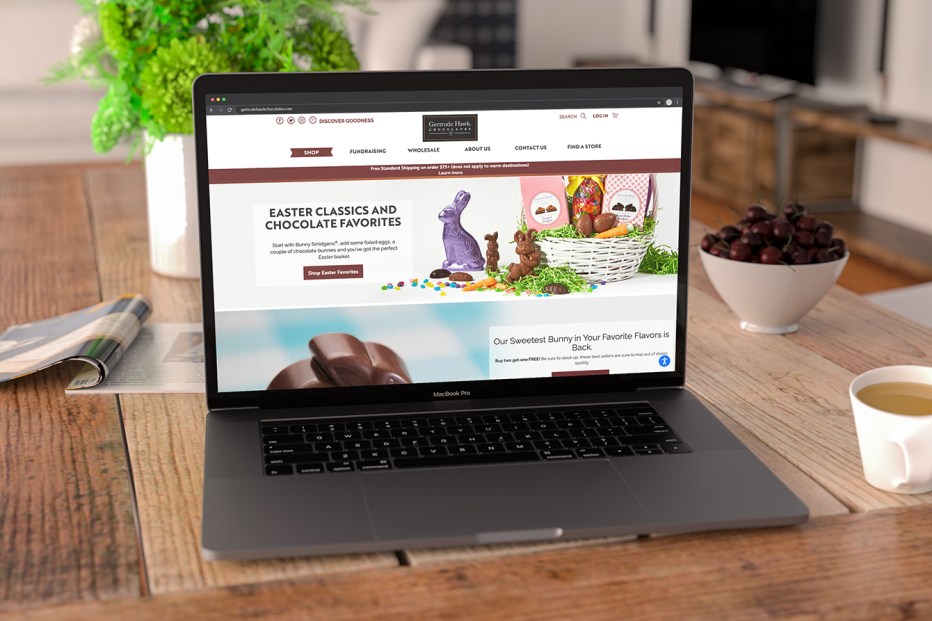
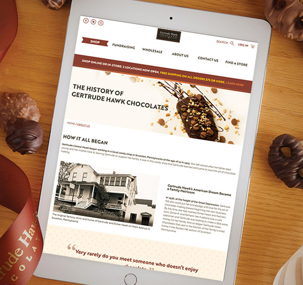
The new website is a chocoholics dream–all of the elements reinforce the imagery of rich, delicious chocolate. The site was updated to include new branding and custom photography. Photos take more prominence than before and allow Gertrude Hawk’s delicious smidgens and other offerings to speak for themselves. The background features cocoa beans, cocoa pods, and chocolate bars – no matter where you’re looking there’s a chocolate twist. The balance of the hero image and featured product categories makes it easier to browse the different product offerings. The highly visual homepage design also features a ‘shop by type’ section, which makes finding desired products easier than ever.
Email Marketing
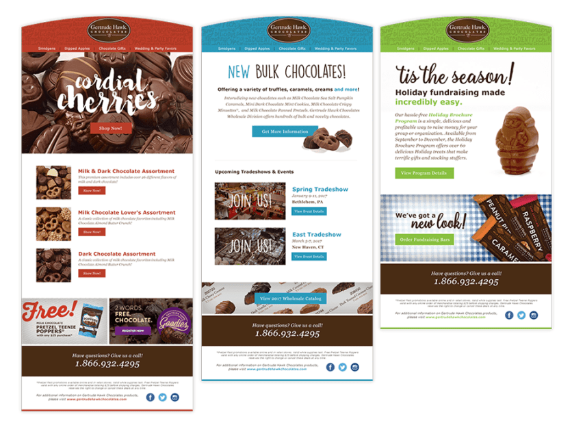
The emails crafted by Weidenhammer Creative aren’t only high-impact and easily changed, they’re also engineered for maximum customer response. The templates have color-coded designs for the three types of emails – fundraising, wholesale, and retail, which makes catering to different types of customers easier than ever. Each is designed to balance information, text, and images in a way that maximizes the content each type of customer would want to see. In addition to the beautiful designs, the overall email marketing strategy for Gertrude Hawk Chocolates was streamlined. Platforms were analyzed, email lists were reorganized, and an in-depth strategy based on analytics was created.
Packaging
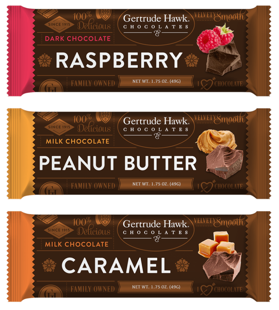
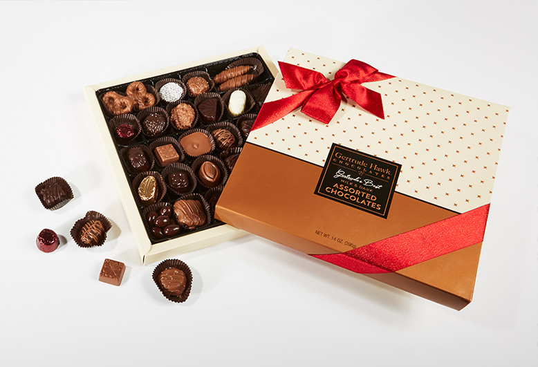
Creating packaging for Gertrude Hawk wasn’t just an opportunity to create product packaging for their fundraising chocolate bars, it was also a way to help tell the Gertrude Hawk Story. The new packaging was meant to help differentiate the many varieties at a glance by incorporating flavor cues and unique colors. These updates make it easier for customers to choose their favorite–even in a box full of various varieties.
Branding
A company that’s been making chocolates for over one hundred years, the branding elements created for Gertrude Hawk gave a 21st-century facelift to a classic brand. Colors were altered to be deep, rich shades evocative of chocolatey treats. Fonts were updated and standardized, and a voice was established for the brand across all of their media elements- packaging, website, email, and their newly created rewards program- Gertrude Hawk Goodies.
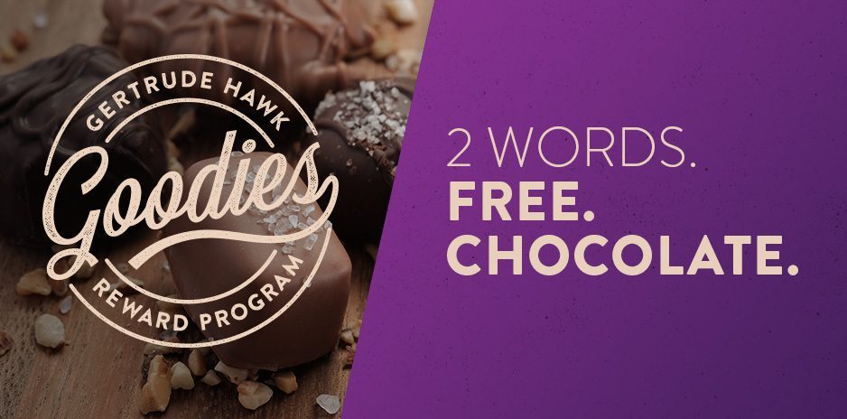
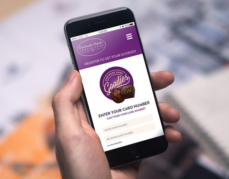
GertrudeHawkGoodies.com
Weidenhammer Creative was so excited to partner with Gertrude Hawk in creating the site and branding for their newly implemented rewards program, Gertrude Hawk Goodies. We ensured that the site was responsive on both mobile and desktop and that it was connected to its own specific email marketing campaigns. One of the elements we also crafted were the membership cards for the program.
Photography
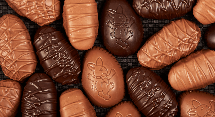
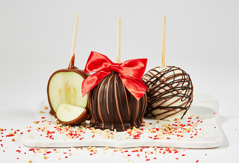
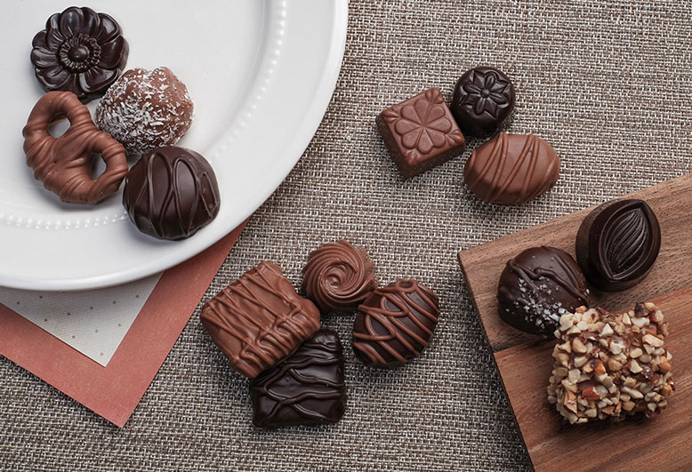
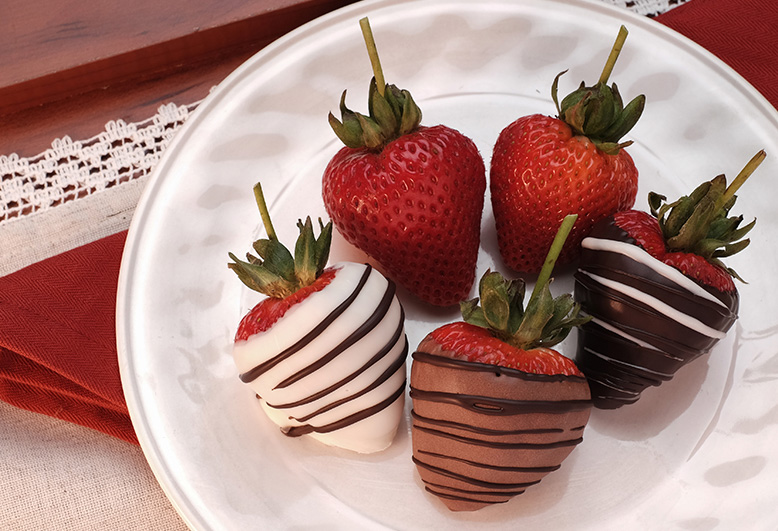
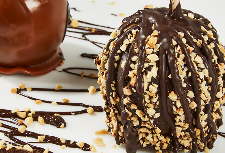
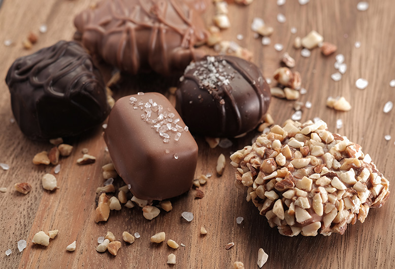
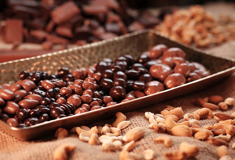
To further heighten the updated brand, and to let the chocolates speak for themselves, Weidenhammer Creative also provided product photography. Outstanding images were needed to show customers that Gertrude Hawk products are as beautiful as they are tasty. The photographs were specifically shot to tie in with the rich, warm branding elements that appear across their marketing collateral.
Collaborating with the marketing team at Gertrude Hawk has been a highlight for Weidenhammer. We had a great time getting creative with chocolate and working on projects that let us create impactful and dynamic marketing collateral. Together, we’ve collaborated on many projects and look forward to the chance to work with their team (and their candy) again.
